Simplified Comments & Collaboration
Project notes are integral for collaboratively editing a Bible translation text, but the current experience is complex, manually repetitive and disparate. Funding to rebuild Paratext in a new architecture from the ground up provided exciting opportunities for innovation. I redesigned Paratext’s commenting experience for simplified flow, ease and alignment with translators’ natural workflow.
— SUMMER 2024 —
Design: Allison Park, Alex Mercado
Developer: Ira Hopkinson
Translation Field Experts
Image
PROBLEM + GOAL
Consultant-to-translator and translator-to-translator communication is central to Bible translation. Yet, many users leave Paratext and rely on an external commenting product for team discussions.
How might we effectively integrate project comments into the text editor and streamline note-creating and searching, to revive collaboration and centralized workflow within Paratext?
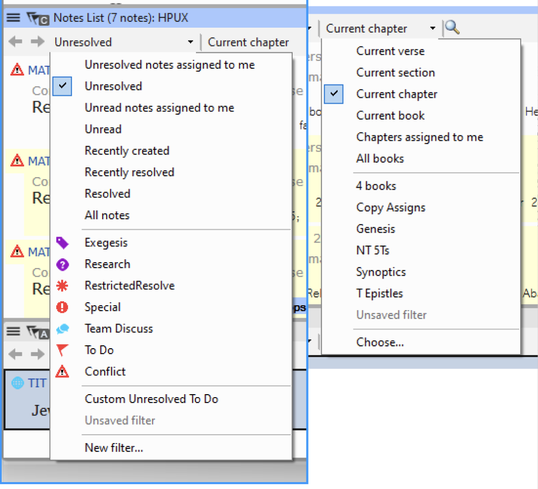
BEFORE: 4 separate flows, reflow problem, clunky annotations & prescriptive design solutions resulting in a sprawl of disconnected features.
after
USER RESEARCH
Our team gathered feedback from 15+ global translation groups at our UX Discovery Workshop in Vietnam. Analyzing this data (alongside user feedback from our: 1. help website 2. issue backlog 3. translation expert interviews) helps us discover:
Why are users so frustrated with project comments?
Unclear visual hierarchy, with scattered icon buttons and text.
Repetitive manual tasks + disconnected flow, navigating to main project menu to create a note
Opening up my Notes List reflowed my entire screen.
Notes are taking up too much of my screen space. Why does a new window panel open up for each note list?
I accidentally selected the wrong list, and now need to repeat the whole process over again.
1
High-level architecture, considering other workflows that have not been defined yet + how this can fit into other use cases.

Journey map + started with high level ideas of the flow (ie. notes coming out of margin comments, in-text annotations, modal dialogs, etc)
touch points

3
What happens when you activate an ephemeral annotation? Expanding on different annotation types + use cases for each.
got feedback from UX team
comment model -> make personal/revision notes feel different
—> sticking to @ mentioning as primary action

High level flow ideation -> in-text annotation, in-margin or modal dialog?
Margins are the best solution:
Other ephemeral annotations (biblical terms, etc) can use margin space when in focused state
All comment actions always appear in one margin space, solving user confusion with window reflow and panels. Inserting notes + view all notes together in same location.
2
Comment box iteration
30+ early sketches/iterations
(commenting on + and - elements)
more text box iteration
***add about late change from cancel/comment -> comment icon because users are more familiar with smart phone /social media messaging /commenting + localization (thinking about this translated into other languages where “comment” word is very long. Need to fit icon buttons + text into a very narrow horizontal column.


Learning from Google Docs commenting (sidebar/margin + states)
I analyzed user flow, comment box design, reply threading and interaction state patterns for familiar commenting experiences in: Figma, Google Docs, Google Keep, Slack, Discord, Notion, Apple Messaging and Instagram.
Past testing reveals:
Many translation communities are inexperienced with laptops and desktop devices. However, almost all express familiarity using Google applications and smart mobile devices.
User rely on visual indicators and changing interaction states to know what they should be clicking on at each given moment in a task.
And so, referencing Google Docs’ commenting experience was a key stepping stone in solving our problem of a disparate commenting flow.
Things we took away from Google Docs:
margin comments alongside a project text + and a parallel comment sidebar
clear interaction states
mentioning with @ interaction behavior)

Consultant notes becomes personal notes to account for how users are actually using notes
While Paratext provides 2 note types- “Revision Notes” and“Consultant Notes- we found that users use notes for:
notes-to-self
recording decisions
task management
research
consultant notes
revision notes
spelling discussions
biblical term discussions
etc…
Inspired by ubiquity and flexibility for many use cases in Notion and Google Docs, worked with annotation UX designer on rebranding consulant notes as personal notes -> same function, but now all users can use, not just consultants.
HMW distinguish between Personal vs revision (assign) note when writing note? How can we make this feel like a very different option that's not the same as assigning it to yourself?
What makes a "personal" note "personal"?
It follows the person to any project or resource
It's private, hidden from other users
How can we make this feel like a very different option HMW not double nest assigning (accessibility)
assign by typing @ into input box
assign by @ button


Side bar / margin area = only 1 flow needed
[***add prototype to showing changing behavior]
side bar margin where other annotations can live - covers many use cases (Study Bible extended notes, Editing Checks, Biblical terms)
prevent reflow
easily collapsible
Google Docs behavior
unified flow - all comments in one space
comments within a project text -> other annotations are also displayed in this space VS comment side bar where only comments are and user can filter like an inbox.


Comment inbox
Notes List -> Comments
issues with original + changes made
Filtering


show the default, hover states + component details here
